Experience Simplicity and Control – Sticker Builder 2.0 Proves the Best UX is the One You Don’t Notice
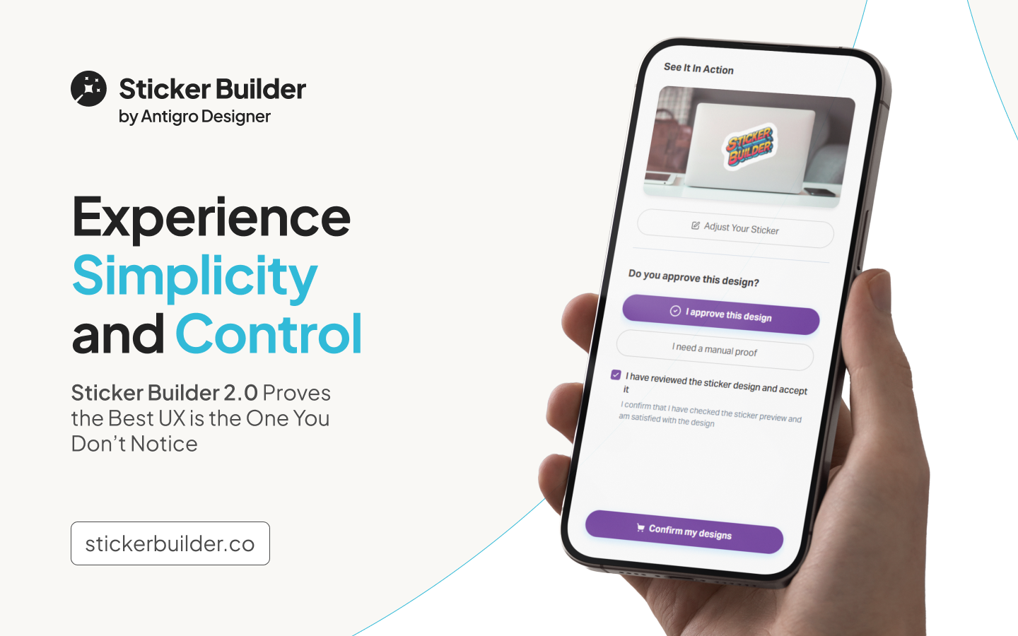
True product value appears when the tool fades into the background and simply works. That’s the philosophy behind Sticker Builder 2.0, the fully redesigned sticker configurator built around clarity and ease. What once felt like a lightweight graphic editor has now become a focused, intuitive ordering flow. Users are now guided effortlessly through the process. Every decision, every feature, is built to support the outcome, not distract from it. The interface gets out of the way so customers can focus on what they actually care about: getting great stickers, fast.
The previous version of Sticker Builder offered flexibility but required effort, as users had to manually adjust settings and switch views, which suited advanced users but not the majority. After months of data analysis and conversations with customers, one message came through loud and clear: most users don’t want to design stickers, they just want to order them. Quickly, accurately, and without back-and-forth. Sticker Builder 2.0 was built around that expectation – fewer clicks, fewer doubts, and more done in less time.
A Smarter, Simpler Way to Order Stickers
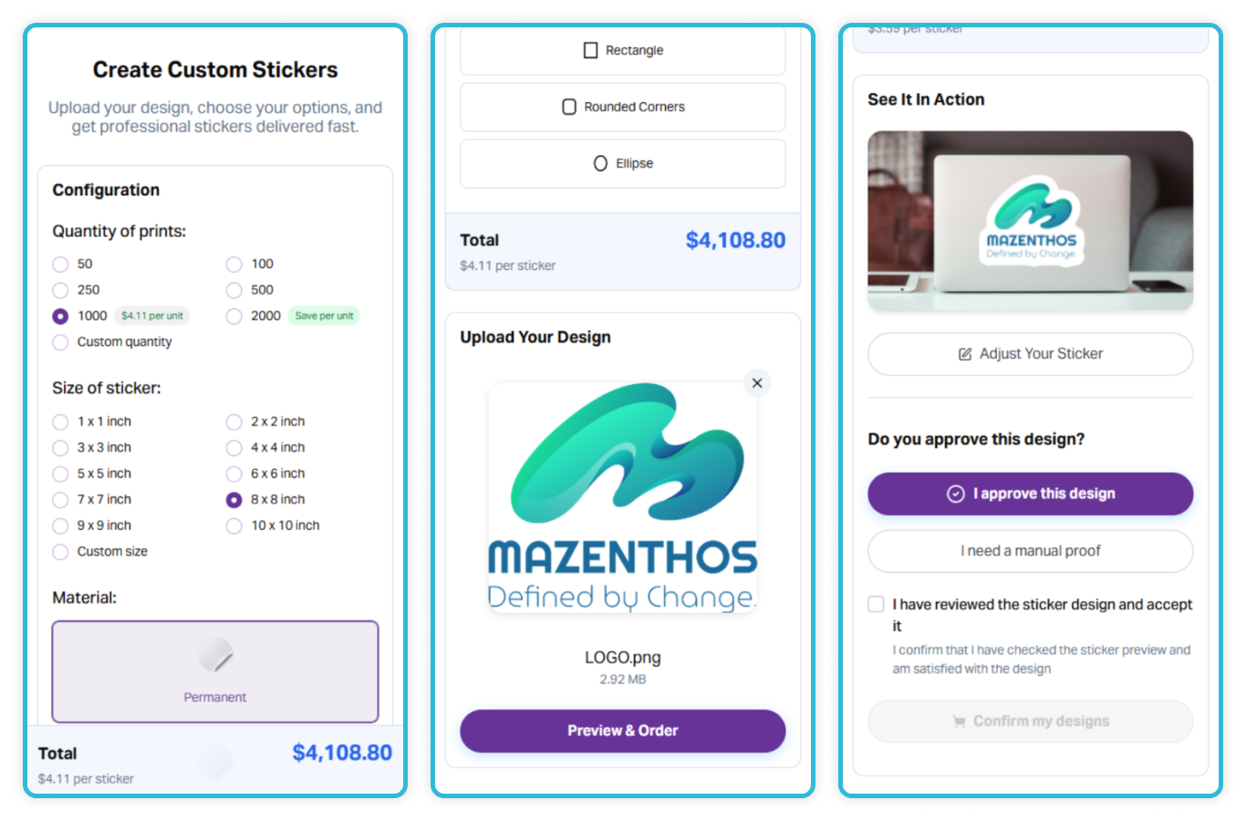
Sticker Builder 2.0 has kept the familiar order configuration layout but transformed it into a modern, single-view experience. Users now select their preferences, upload a file, and immediately see the result – all without entering the editor. This redesigned flow was intentionally streamlined to simplify the process and reduce the number of decisions the user has to make. The goal was to create a smoother, faster path to completion without compromising on flexibility.
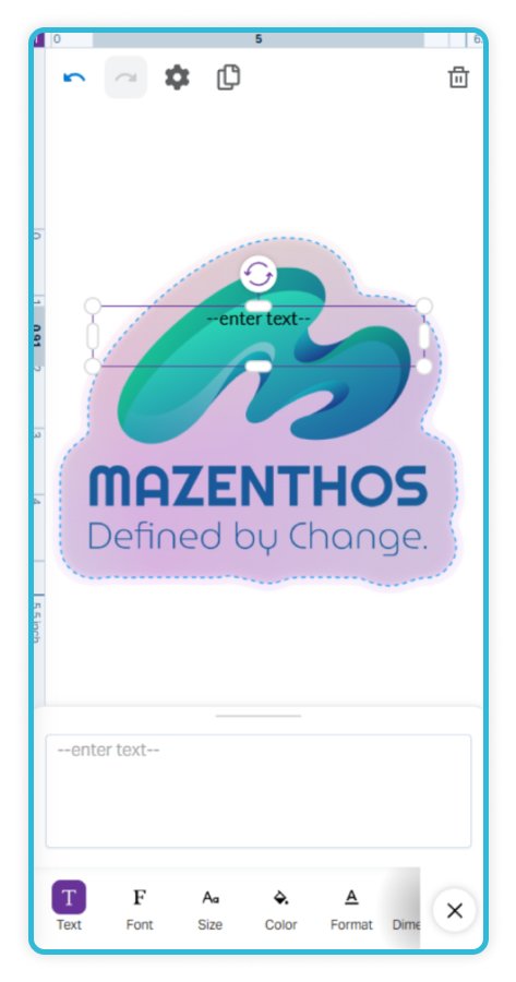
Although the editor is still available, it’s no longer part of the default journey. Users can access it only if they truly need to make adjustments, which helps maintain a clean and efficient experience. This approach supports a sense of control, which, according to research by the Nielsen Norman Group, significantly enhances user satisfaction. Even if users don’t actively customize their design, knowing they have the option gives them confidence in the tool.

The design of Sticker Builder 2.0 is grounded in the principles of calm commerce – simplicity, clarity, and a sense of control throughout the purchase journey. Visual noise was intentionally removed in favor of space, balance, and readability, creating an interface that feels intuitive and focused. Key design decisions were shaped by CUX (Customer Experience) guidelines, ensuring that every interaction serves a clear purpose. Instead of overwhelming the user with messages or flashy effects, the interface gently guides them toward completing their order.
Research from the Baymard Institute shows that simplifying the purchase flow and removing unnecessary steps can reduce checkout time by 20-30% and increase conversions by 35%. Sticker Builder 2.0 goes beyond these insights. In a test sample of 2,000 orders, the average completion time was 34% faster, and the configuration completion rate increased by 48% – confirming that the new, streamlined process significantly improves both efficiency and user satisfaction. These results demonstrate how calm, purposeful design can deliver measurable business value.
Smart Features That Stay Out of the Way – Until Your Customers Need Them
Studies from platforms like Shopify and Canva highlight that users feel more satisfied and build greater trust in a product when the interface offers clear visuals and real-time feedback. Sticker Builder 2.0 takes this insight further by blending ease of use with a sense of control. The layout is simple and effective: users set preferences such as size, quantity, material, and shape on the left, while the right side is dedicated to uploading artwork, either from a computer or directly via a QR code from a mobile device. This setup reduces confusion and helps users feel confident in their choices from the very start.
A key innovation is the system’s ability to intelligently suggest background removal only when it’s truly necessary. This smart, context-based assistance speeds up the process and enhances the feeling that the tool adapts to user needs. Instead of overwhelming the user with options, it steps in only at the right moments. This thoughtful approach makes the experience feel efficient and user-centric, while reinforcing the idea that the system works with – not against – the user.
Everything in One Place: How Embedded Features Like QR Codes Boost User Confidence
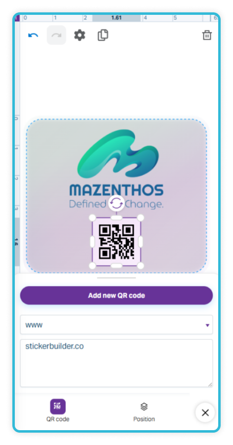
A key factor in building user confidence is keeping the entire experience within one store environment. Sticker Builder 2.0 eliminates the need for external redirects or third-party tools, allowing the user to complete the entire journey in one seamless, uninterrupted flow. There are no page reloads or context switches – just a smooth, continuous process that feels familiar from start to finish. One practical example of this embedded approach is the built-in QR code generator, which lets users quickly add a scannable code to their sticker without leaving the configurator.
This approach minimizes the risk of context switching – a factor which, according to research, can increase cart abandonment by 15–25% when users are forced to leave their familiar shopping flow. Sticker Builder 2.0 maintains a seamless experience, keeping customers within a consistent and familiar environment. It’s a deliberate use of minimalism – not by stripping features, but by avoiding unnecessary complexity. By staying within the brand’s ecosystem, users feel more secure and more in control. In practice, this thoughtful design leads to measurable improvements in Customer Experience and higher overall satisfaction.
The new Sticker Builder proves that real innovation in e-commerce comes not from adding more features, but from removing the unnecessary ones. By simplifying the flow, offering transparent pricing, and providing instant previews, it creates a faster, more confident, and more satisfying shopping experience. This smart simplicity sets a new benchmark in product personalization and it simply works the way users expect.
“We wanted to create a tool that doesn’t get in the way of the purchase, but instead lets the user fully focus on the outcome. Good UX isn’t about grabbing attention, it’s about working smoothly, predictably, and earning trust. It’s an experience designed to bring a sense of calm and control.” Dawid Świnicki, Product Designer at Antigro Designer.


